Learning Objectives:
Plot line and 2D plot in Python using matploblib
Know good plotting habit: labels, titlesm legends, proper scaling, and saving figures in good format
We continue to use the Denver Water Department meteorological station data.
We now import matplotlib for plotting.
# Import libraries
import numpy as np
import matplotlib.pyplot as plt
# Load max temperature data into a numpy array.
# According to the README this corresponds to monthly maximum temperatures
# from 2000 to 2022 at the Dever Water Department meteorological station.
tmax = np.loadtxt(fname='../data/meteo_denver_tmax_2000_2022.txt', delimiter='\t')Plot line plots
months = np.arange(1,13,1)

fig, ax = plt.subplots(1, 1, figsize=(4, 3))
ax.plot(months, tmax[0,:])
ax.set_xlabel('Month', fontsize=14)
ax.set_ylabel('Temperature (°C)', fontsize=14)

plt.title('Maximum Temperature at the Denver Water Dept \n in the year 2000')
plt.show()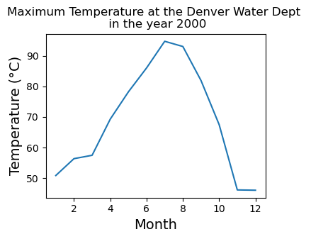
We will now plot a few year. Note:
The use of legends
Saving the figure into a vector format (whenever possible)
fig, ax = plt.subplots(1, 1, figsize=(4, 3))
ax.plot(months, tmax[0,:],label='2000')
ax.plot(months, tmax[1,:],label='2001')
ax.plot(months, tmax[2,:],label='2002')
ax.set_xlabel('Month', fontsize=14)
ax.set_ylabel('Temperature (°C)', fontsize=14)
ax.legend()

plt.title('Maximum Temperature at the Denver Water Dept \n in the year 2000-2002')

plt.savefig("output_figs/den_max_temp_00to02.pdf", bbox_inches="tight")
plt.show()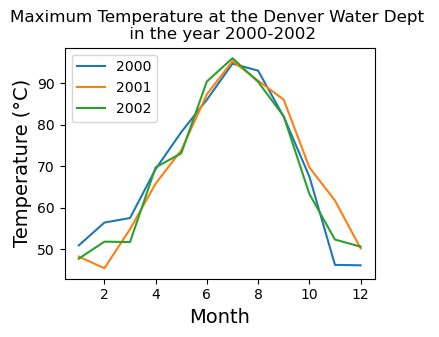
Plotting 2D plot
The first step in analyzing 2D data is to plot all the values using imshow
# imshow is good for taking a quick look at the data.
# It plots the array in its native form (origin on the top left)
plt.imshow(tmax)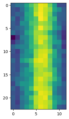
Making this better using pcolor
Choose a good colormap is important for 2D plot
When saving 2D plot, vector format can be too large. When we have to save to raster format, choose a good
dpi(Dots Per Inch) for your purpose200 is small and fast
400-600 ready for print in a report/journal paper
Consider go larger if your plots will be on a poster
# Create an array for the calendar months
months = np.arange(1, 13)
# Create an array for years from 2000 to 2022
years = np.arange(2000, 2023)

# Visualize the 2D array
fig, ax = plt.subplots(1, 1, figsize=(4, 4))
cs = ax.pcolor(months, years, tmax, cmap='inferno')
ax.set_ylabel('Year', fontsize=14)
ax.set_xlabel('Month', fontsize=14)
cbar = plt.colorbar(cs)
cbar.set_label(r'Maximum Temperature [$^\circ$F]', fontsize=14, labelpad=14)
plt.title('Maximum Temperature at the Denver Water Dept')

plt.savefig("output_figs/den_max_temp_00to02.png", dpi=400, bbox_inches="tight")
plt.show()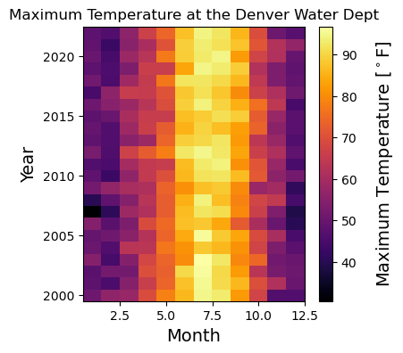
Key points
You can use
matplotlibto plot.Your plots should have proper labels, titles, and legends indicating what’s plotted.
Picking a good colormap is only only for ascetic. Interpreting your data might depends on it.
Save to vector format when possible